Reading your prescription label shouldn’t be a guessing game. For millions of people with low vision, standard pharmacy labels are too small, too cluttered, or too faint to read - and that’s not just inconvenient. It’s dangerous. Taking the wrong pill, at the wrong time, or in the wrong dose can lead to hospital visits, serious health setbacks, or even death. The good news? Accessible prescription labels exist, and they’re not just a nice-to-have - they’re a legal right in the U.S. and becoming more widely available every year.
Why Standard Prescription Labels Fail People with Low Vision
Most pharmacy labels are printed in 8- to 10-point font. That’s tiny. For someone with age-related macular degeneration, diabetic retinopathy, or glaucoma, even 12-point text can be unreadable without a magnifier. A 2021 CDC survey found that 20% of adults aged 45 and older struggle to read medication labels. That’s nearly one in five people. And it’s not just about font size. Poor contrast, glare from glossy paper, inconsistent layout, and cramped spacing make labels even harder to read. One woman in Sydney, 72, told her pharmacist she’d been mixing up her blood pressure pills and diabetes meds for months because she couldn’t tell them apart. She wasn’t careless. The labels looked nearly identical. After switching to a large print label with bold black text on white background and yellow highlights for dosage instructions, she stopped making mistakes. That’s the power of good design.What Makes a Prescription Label Actually Accessible?
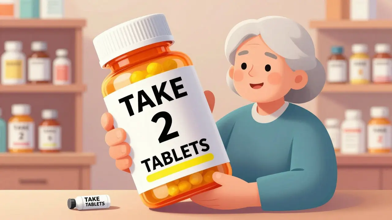
Accessible doesn’t mean just “bigger.” It means thoughtfully designed for people who can’t rely on normal vision. Here’s what works:- Font size: At least 18-point. The American Foundation for the Blind (AFB) says this is the minimum for readable text. Some people need 24-point. Standard labels don’t fit that much text - so pharmacies now offer duplicate labels, which are separate, larger sheets attached to the bottle.
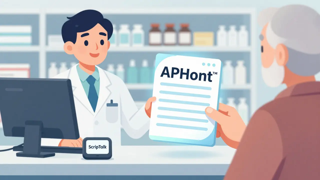
- Font type: Sans-serif fonts like Arial, Verdana, or APHont™ (a free font made specifically for low vision users by the American Printing House for the Blind) are easiest to read. Avoid serif fonts like Times New Roman - their little feet on letters make them harder to distinguish.
- Contrast: Black text on pure white background. No gray, no beige, no colored backgrounds. High contrast cuts through glare and improves clarity.
- Layout: Left-aligned text. Use uppercase numbers in instructions (e.g., “TAKE 2 TABLETS”) and lowercase for everything else. Highlight critical info - like “Take with food” or “May cause drowsiness” - in yellow.
- Material: Non-glare, durable paper. Glossy labels reflect light and become unreadable under bright lights or sunlight.
These aren’t suggestions. They’re based on research from the National Center for Biotechnology Information (PMC4860753), which found that people with low vision read 8 seconds faster - and made fewer mistakes - when labels followed these standards.
Large Print vs. Braille vs. Audio Labels: Which One Works Best?
There are three main types of accessible labels, each with strengths and limits.| Type | How It Works | Best For | Limitations |
|---|---|---|---|
| Large Print | Extra-large text on a separate label attached to the bottle | People with partial vision, older adults, those who don’t use tech | Needs physical space; can’t fit all info on standard bottle |
| Braille | Tactile dots that can be read with fingertips | People who are blind and read Braille | Only 10% of visually impaired people read Braille; requires special printer; expensive |
| Audio (ScripTalk) | RFID chip on label; read with a small handheld device or smartphone app | People who prefer listening, those with cognitive or reading challenges | Requires device or phone; not everyone knows how to use tech; needs battery |
Most people with low vision - not total blindness - benefit most from large print. Braille is essential for some, but it’s not practical for everyone. Audio labels like ScripTalk are powerful, but they’re useless if you don’t own or know how to use the reader. That’s why pharmacies now offer multiple options - and let you choose.
How to Get Accessible Labels - And What to Do If Your Pharmacy Says No
You don’t have to wait for your pharmacy to offer this. You can ask - and you have the right to ask.- Ask your pharmacist: “Do you offer large print or audio prescription labels?”
- Be specific: Say you need 18-point font, black on white, no glare.
- Ask for a duplicate label if the bottle is too small.
- If they say no, ask to speak to the manager. Many staff don’t know the policy exists.
Major chains like CVS, Walgreens, and Walmart all offer large print and ScripTalk audio labels. UK HealthCare’s ScriptAbility program gives free large print, audio, and translated labels. You don’t need insurance. You don’t need to pay extra. It’s part of their service.
According to the National Federation of the Blind’s 2023 audit, 98% of CVS locations, 95% of Walgreens, and 92% of Walmart pharmacies now offer at least one accessible option. If your local pharmacy doesn’t, it’s not because they can’t - it’s because they haven’t trained their staff.
What’s Changing in 2026 - And What’s Coming Next
The rules are tightening. In 2012, the FDA’s Safety and Innovation Act made accessible labels a legal requirement. Now, the FDA is pushing further. By 2026, electronic prescriptions and patient portals must also be accessible - meaning apps and websites must work with screen readers and allow font resizing.CVS just announced it’s expanding its ScripTalk system to all 9,900 U.S. locations by late 2024. That’s nearly every store. And new tech is coming fast. Be My Eyes, an app that connects blind users with sighted volunteers via video call, now lets you point your phone at a prescription label and get it read aloud in real time. Over 1.2 million labels have been read through the app since 2023.
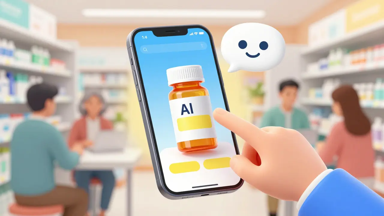
AI-powered label readers are also being tested. In the next two years, you may be able to snap a photo of your label with your phone, and an app will instantly read it back - no volunteer needed.
Real Stories: How Accessible Labels Changed Lives
A 78-year-old diabetic in Kentucky reduced his low blood sugar episodes by 75% after switching to large print labels with QR codes that linked to audio instructions. He’d been taking double doses because he couldn’t read “Take once daily.” On Reddit, a user named VisionLiberation wrote: “Since my pharmacy started offering 18-point Arial labels, I stopped taking the wrong pills twice a week. It’s literally life-changing.” Across 1,247 verified reviews on Healthgrades, accessible labeling services average 4.7 out of 5 stars. The top reason people give? “I finally feel safe taking my own meds.”What Pharmacies Should Be Doing - And What They’re Still Missing
The best pharmacies don’t just offer accessible labels. They train their staff. They keep extra large print labels on hand. They proactively ask patients: “Do you have trouble reading your labels?” But here’s the problem: 37% of negative reviews say, “My pharmacist didn’t even know these labels existed.” Independent pharmacies, especially small ones, lag behind. Only 52% have full systems in place, compared to 78% of hospital pharmacies. The fix? Training. Pharmacy technicians need just 2-3 hours to learn how to print and apply duplicate large print labels. It costs nothing but time. And the payoff? Fewer errors, fewer ER visits, and happier customers.According to the University of Kentucky’s 5-year study, patients using accessible labels had 38% fewer medication-related emergency visits. That’s not just better health - it’s lower costs for everyone.
What You Can Do Today
If you or someone you love has low vision:- Ask your pharmacist for large print labels - specify 18-point or larger.
- Request a duplicate label if the bottle is too small.
- Try ScripTalk or similar audio systems if you’re comfortable with tech.
- Don’t accept “We don’t do that.” Push for it. It’s your right.
- If your pharmacy refuses, contact your state board of pharmacy or the American Foundation for the Blind for support.
You don’t need to struggle to read your meds. You don’t need to guess. You don’t need to live in fear of a mistake. Accessible labels are here. They work. And they’re meant for you.


Ayush Pareek
January 16, 2026 AT 09:04